Components
Card
A flat bordered surface with no shadow. Compose an optional full-bleed ds-card__media image, a title-voiced ds-card__header, a ds-card__body, and a ds-card__footer set off by a top rule on the alt background. Add --clickable to make the whole card an affordance.
Anatomy
Header, body, and a footer separated by a top rule. The footer sits on --ds-bg-alt.
Senior consultant
Day rate and margin for a confirmed mission, derived from the salary and the agreed billing terms.
<div class="ds-card">
  <div class="ds-card__header"><h3 class="ds-card__title">Senior consultant</h3></div>
  <div class="ds-card__body">Day rate and margin for a confirmed mission…</div>
  <div class="ds-card__footer">Updated 2 hours ago</div>
</div>
With media
A full-bleed ds-card__media image at the top, flush to the border.
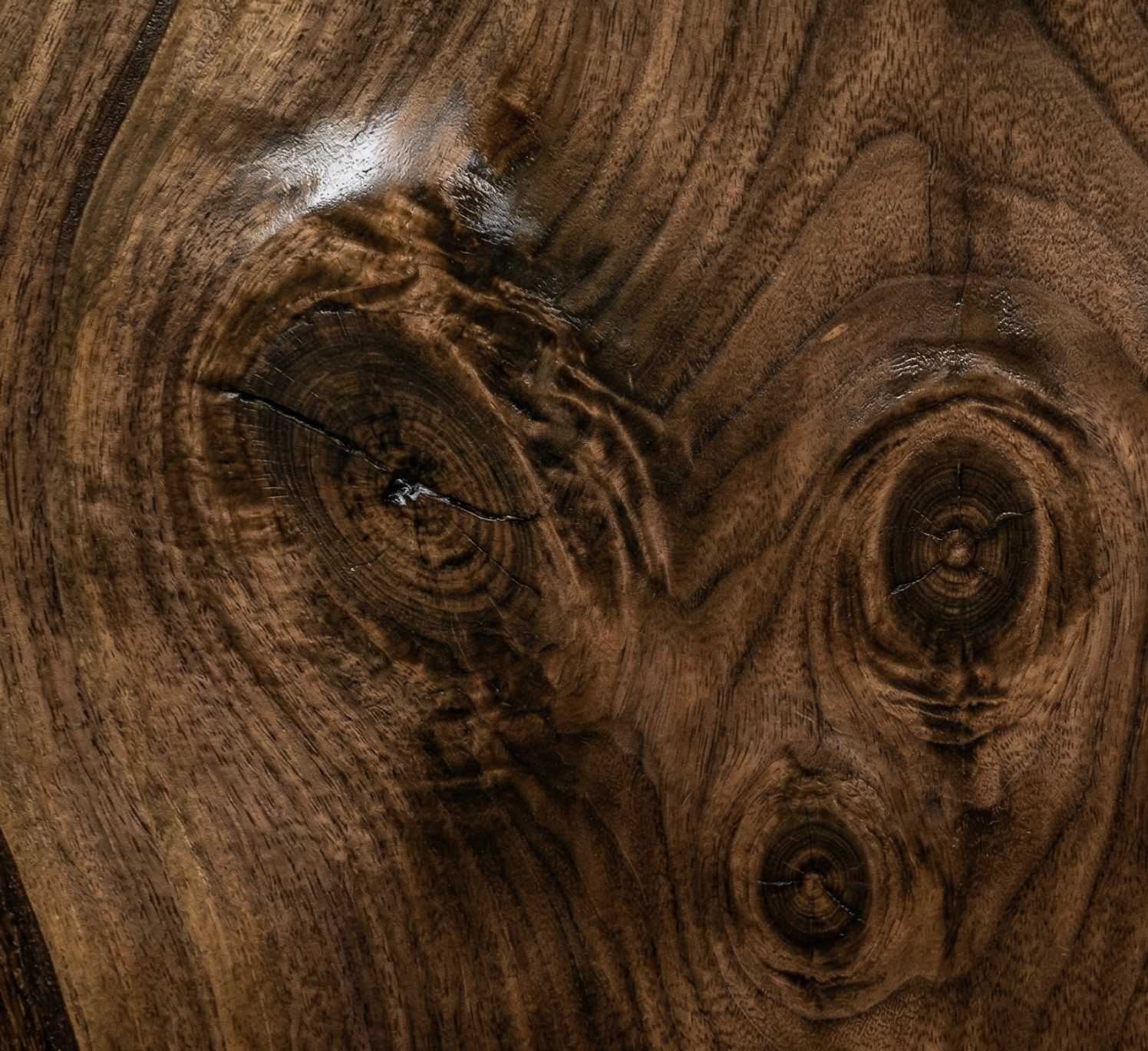
Walnut texture
A material sample card with a full-bleed image header.
<div class="ds-card">
  <img class="ds-card__media" src="walnut.png" alt="">
  <div class="ds-card__header"><h3 class="ds-card__title">Walnut texture</h3></div>
  <div class="ds-card__body">A material sample card…</div>
</div>
Divided blocks & clickable
Stack ds-card__block regions separated by a soft rule. The --clickable modifier adds a hover background and pointer.
First region
Second region, separated by a soft rule
Third region
<div class="ds-card ds-card--clickable" tabindex="0" role="button">
  <div class="ds-card__block">First region</div>
  <div class="ds-card__block">Second region…</div>
  <div class="ds-card__block">Third region</div>
</div>
React
The Card component renders the same markup. Pass media as an image src string or any node.
import { Card } from "@diametral/design-system/react";

<Card
  title="Senior consultant"
  media="/walnut.png"
  footer="Updated 2 hours ago"
  clickable
  onClick={openMission}
>
  Day rate and margin for a confirmed mission.
</Card>